The first stage in producing my own Empire-styled production piece for FD5, is to choose my photography, graphics and colour scheme. Empire chose the colour scheme of the Dark Knight Rises article based on the colours within the photography, so I will do the same.
Though all of my photography will be entirely created by me, I will still base it on that of FD5.

I first took a look at one of the posters for FD5.
The main colours I noticed that are present within this poster are REDS, DARK BLUES, and BLACK.
Red is an aggressive, passionate colour, which attracts attention very quickly, but can also symbolise love. Blue can be calming, but also cold and depressing. Black symbolises power and authority, but also evil and death. The colours chosen in the poster reflects the themes within the film: The film is aggressive and violent, but also has 'love' within it (the main character and his love interest). The characters do have a tendency to feel disheartened and depressed when more and more people are killed off by Death. Death itself has a power and authority over the characters, as they are powerless to stop anything happening to them. Death is seen as something malevolent and evil.The imagery itself is quite interesting: the bridge gives a hint at what the opening death sequence is, and is positioned in the middle of the poster. Bridges symbolise different things, for example, a crossing between two worlds which could be the human world and the afterlife, in the case of this film. Bridges over water symbolise emotions and getting over difficult decisions, which definitely relates to the characters in the film.
The stormy sky could symbolise many things: firstly, it symbolises an omen of bad things to come. Storms are natural disasters: therefore symbolising greater powers than normal humans possess.
The blurred text is interesting: It almost looks like shadows, which creates an ominous feeling, or it looks like smeared blood which relates back to the gore element of the film. Blurred things often create a sense of confusion, which does relate back to the characters, as they are confused about the situation they're in. The text itself is in a serif font, which promotes formality and tradition. The traditional element may relate to the superstitious nature of some of the characters, or the fact that Death is humanised, which dates back to mythology and folklore. The end of the number 5 has been edited to look a lot more pointed at the end. The number 5 in usual serif font is quite rounded. One reason for changing it, could be to make it look like the pointed blade of a knife, or the Grim Reaper's Scythe.

The Grim Reaper, or Death, is commonly depicted carrying a scythe to 'reap' souls. This edit to the number 5 could be seen as a nod to this depiction of Death, or it could just be seen as a way of making the number 5 look more menacing.

This second poster boasts a colour scheme identical to the first one, which in term contains all the same symbolism. However, this poster is different to the first one: there's no bridge image, but there is a skull with what looks like iron poles/rods obliterating and destroying it. This could possibly be a link back to the way that the characters are destroyed in different ways. The skull is shown here to be very fragile; it's cracked, splintered and is surrounded by debris that could be from the skull or from the explosion around it. This could also be related to how humans life is very fragile, and how easy it is to fall victim to a fatal accident that we are not in control of. The human skull is used to signify the Grim Reaper/Death, or to again signify the mortality of the characters in the film.
The tagline "Death has never been closer" is typical of those of the FD5 posters. The idea of 'closeness' could mean either that the characters have even less time to live, or that Death is a personified entity, and is close behind the characters, following them. The number 5 in this poster is definitely meant to look like a knife or a scythe: it's metallic and the 'blade' is covered in red blood: linking back to the gore genre of the film.
To decide on the right photography to use, I'm also going to have to think about the focus of my interview.
My interview is not really about certain individual characters, like the Dark Knight Rises film, but it is about the themes explored within the film, and about the way in which the 5th film is a nod to the first film. Therefore, my photography will be general and relating back to the themes.


My photography will include a skull/skulls, which seems to be a main feature of the images presented in the final destination posters.

I would also like to create photography that relates back to the first film. I really liked the idea of the half skull, half face portrait on one of the Final Destination, so I was considering doing something similar with the fractured/broken skull idea.
As for the photography within the article, I'm going to do something similar to the Dark Knight Rises and the Pirates articles. I am going to create 'behind the scenes' styled images for my interview, because Empire is read by audiences who are really interested in film, so therefore would want to see behind-the-scenes action which can give away more information about the way that the film was made.
I will be using three different people for the roles within my photography: an adult male (the lead character), an adult female (love interest of the lead character) and another adult male (the director of the film). My photography will include slightly gory images, and also photographs of the director talking to the actors.

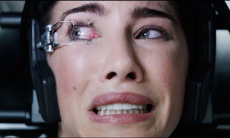


Film stills like these would work really well within my article: they display enough action and enough gore to intrigue the audience without disgusting them.


A photo of some of the actors from FD5 on set. These behind the scenes photos give the audience a little taster of what it was like to film the movie.

These behind-the-scenes shots are from different films but still convey the right kind of look I want. There needs to be a distinct focus on the director, as the interview is with him.

Behind the scenes of the Swedish adaptation of The Girl With The Dragon Tattoo


With my own shots, I want to really reflect the tone of the movie, stylistically and in subject too.


