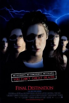
The first sketches I completed are ideas for the front cover of Empire. I did some research into Empire covers


I noticed that whilst the characters on the front might not be real/realistic, they are still somewhat human-looking. Therefore, my own front cover would have to include an actor. However, though I will have to use an actor, I can get creative with my cover in terms of the editing and theme.


These are my sketches for my front cover. I basically had two ideas for the cover, both including the skull theme of all of the Final Destination artwork.
The first sketch is partly based on The Final Destination's poster, of the half human, half skull face. I had an idea to create a similar image, but instead of shattered glass, I would have shattered rubble around the skull, like the Final Destination 5 posters.


The second sketch is based closely from the first Final Destination poster, of the half skull, half human faces of the actors. Whilst this idea is much simpler, I greatly prefer it, because it relates back to the first film. The fifth film's director, Steven Quale, said that he wanted to make the fifth film similar to the first one, which he greatly admired, so this idea really makes sense and would show that he was trying to do that.
I have also completed numerous sketches of ideas of the photography I will create for the inside of the article.
Firstly, I will include stills from the film, as all film articles do: to give the audience a taster of what they will see, and what they should expect to see. It also shows some of the action, to really excite the audience.


These first two sketches are inspired by some of the stills from FD5, of the main characters watching the commotion of the bridge sequence. I feel like the first sketch, where the characters are stationary conveys more emotion than the second sketch, which conveys action. I think that both ideas are important for the audience to see some kind of action, though not enough to give too much away.


I also drew up a few sketches of 'death sequence' type stills, of some of the characters during their death sequences. The first sketch is inspired by the death sequence of the teacher, Valerie Lewton, in the first final destination film.

I think it would be important to show some gore in my article, though I perhaps need to think how much gore there is going to be - too much might put off some audiences from reading, though I think that audiences that aren't fans of gore might not be interested to read the article anyway.
The second sketch is probably something more similar to what I would like to portray. The gore is a little more subtle, but still effective, and doesn't give too much away about how the character died, which I think is very important.
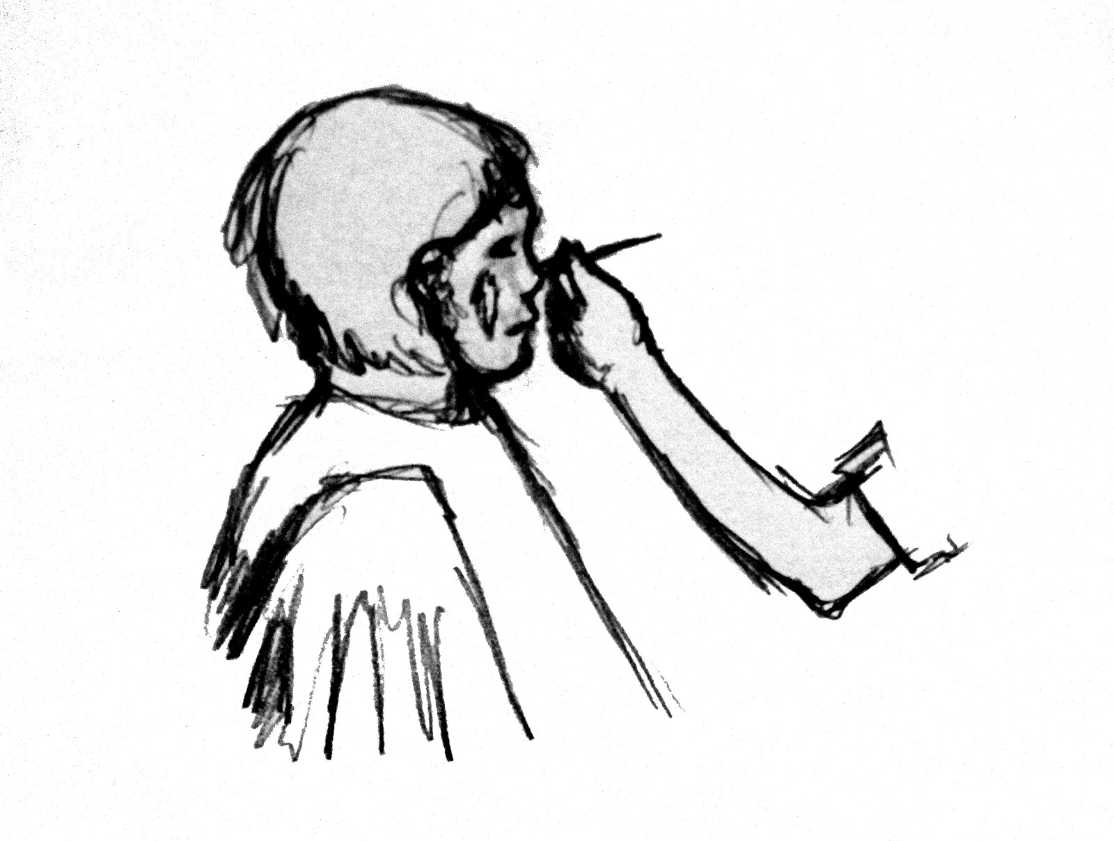
I would also like to include 'behind the scenes' type images in my article, as this is a pretty big convention of Empire's feature articles. The audience will be much more attracted to my article if I show special information about the movie, as they could just look at stills online. I need to really push forward the fact that Empire has 'special access' that will make an audience want to buy Empire over any other film magazine.

This is a sketch based on the 'crime scene' on set photos from FD5. I wanted to include a photo of the director, because the article is only speaking to him. It would be interesting to show how the director works with his actors, and would help the audience gain an impression of what he's like as a person and a director. This is important, as the audience can start to relate to the director.

I've also decided that I'd like to look further into the gore of the film, since the special effects of the film will be such a massive part of the interview. I also have an interest in SFX wounds, and I've gotten very good at creating very realistic wounds, so I feel that this kind of detail will only add to the realism of my article.

I'd like to include a behind the scenes look at the makeup being applied to an actor, and how the effects were achieved, along with perhaps a few box outs with more facts/information about the effects. I'd also like to include a close up of the makeup, to show it's detail properly, which I think could be really interesting.
Overall, I think the imagery in my magazine cover/article not only fits the conventions of the publication, but also fits the conventions of the horror genre and of the Final Destination franchise itself. I'm aiming to really create a professional, realistic quality to my photography, which will strengthen my interview. I've noticed that some production pieces will be successful in terms of graphic design, and the article itself, but without professional quality photos, it unfortunately makes the piece just fall short. This is what I'm aiming to avoid when I take/edit my photography.
No comments:
Post a Comment