Thursday 8 March 2012

Empire Front Cover - Editing 2

The next step for my cover was to fill the space at the bottom. 
From looking at previous Empire covers, the bottom is often used to place more names of films. Sometimes the word 'Plus' is used, and other times just the '+' symbol is used. 


Inspired by the Public Enemies Empire cover, I created something similar on my own front cover. 

I did some research into films that came out in the same month as Final Destination 5 - which was released in August 2011. I went onto the website Movie Web, and found a webpage with all of August's releases on it. 


The films I have selected to use are as follows: 

+  30 Minutes Or Less, Fright Night, One Day, Columbiana
The Debt, Grave Encounters, Atrocious, Brighton Rock, The Change Up


After adding the '+' which I chose to do in the dark red, I added the film titles at the bottom. To separate each title, I inserted '//', which seems to be a convention of Empire's covers. 

Inspired by the 2008 Harry Potter cover, I decided to play around with different colours with my titles. 


I decided on alternating the titles between white and a dark blue colour, because these are the colours of the Final Destination franchise. I also added in red for the '//' dividers, to create more visual impact. 
I used the font style TW Cen Mt, as it fits in with the rest of the typography.

So far, my cover is looking more and more realistic, but I need to work now on adding in the other elements and paying attention to detail as I go along. 

The next detail I needed to add was a by-line type heading to go with the Final Destination headings. 


On further inspection of the by-line type headings of the Public Enemies Empire cover, I noticed that conventionally the by-lines need to be exciting, and should entice the reader to pick up the magazine. I also noticed that the phrases need to be catchy, 'Steals Summer' - the use of alliteration is interesting, and will stick in a reader's mind. The mention of famous names is also a key component: as well as the image itself, the reader will also pick up on famous names which will intrigue them. The language is very informal and I'll also need to convey this in my own titling. 


In the same font style and in the dark blue colour I'd used in the film titling at the bottom, I added the phrase "STEVEN QUALE TALKS THREE DIMENSIONAL DEATH!" 
I've included the name of the director, to entice fans of his work, the word 'talks' is very informal and again reinforces the idea that Empire get special access to actors,directors and special information, and the phrase 'three dimensional death' is catchy and interesting, because of the use of alliteration. Also, I felt that because the article will focus a lot on the 3D of the film, and because 3D is so important to Quale as he worked on the Avatar 3D with Cameron, I felt this was another reason as to why I should include it. 


I also noticed that the dark blue only looked good on black, so I decided to create a black outline where the text was overlapping the photo. I could have moved the text off of the photograph, but I wanted to keep it united with the rest of the typography, so felt it would look much better overlapped. The diagonal line of the typography is also another way to keep it unified, as it's at the same angle as the 'Final'.


To create this outline, I followed some very simple steps. On the layer of the title, I right clicked and selected 'Blending Options'. Then, I selected 'outer glow', and chose a black colour. I set the opacity to 100, and the spread to 100, and then the size to 7, quite small, but still enough to make a difference. 


So far, I think the elements of my cover are really coming together well. The colour scheme with the added blue just adds something extra to the cover, and also keeps it related to the film. The tiny details, like the customisation I made to the fonts, the blood splatters, the slight colour changes to things, etc, make the cover successful. 

Tuesday 6 March 2012

Empire Front Cover - Editing


Before I start working on my front cover, I decided to look over the edited 
image again. I decided to make some tiny, minor adjustments, for example, I got rid of the 'chin shadow' because it just didn't look right blended into the skull.  I did this by using the 'healing brush' tool, selected the colour around the shadow, and painted over it. 


I also edited out a couple of blemishes and the dark circles around my actor's eyes. 


It may seem a bit picky, but I do this with all of my photography - it ensures a much more professional look and is much less distracting to the eye. Sometimes tiny details like this can really improve the overall image. 

The next step for me was to create the Empire masthead. I did not simply want to copy and paste the masthead, I wanted to do something more special with it. 
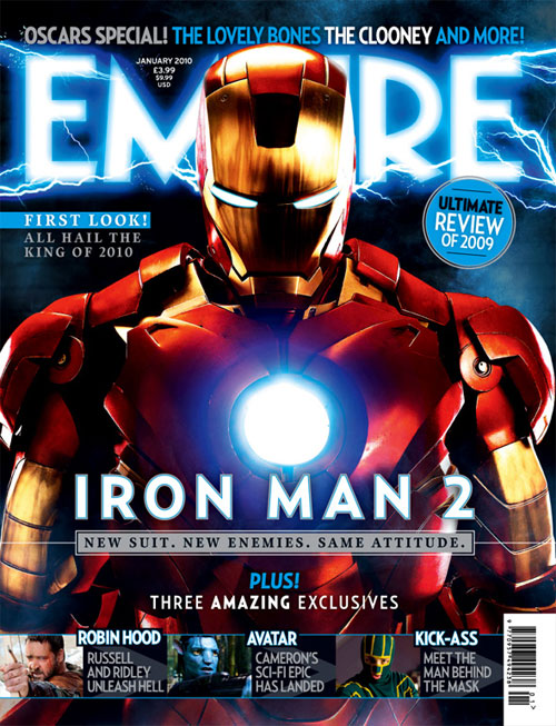
From my research into front covers, I've noticed that for special interviews, Empire will adopt a 'theme' and the theme will leak into the logo. 


These two covers show how elements of the characters' design influences the masthead editing, which really makes the front cover very strong. 


This front cover, for the Kick Ass film, really inspired me. I loved how the masthead still retained the conventional red Empire colour, but the bloody typography added to the theme of the cover, and blends in well with the image. 

To create my own bloody Empire masthead, I first found a good sized image of the logo. 


Using the line tool, in size 1 and in black, I created a layer above the masthead and traced the outline of the typography. 


After I was done, I was left with this: a very solid and clear looking masthead, free to edit as I please. 

Creating the bloody effect was a little more tricky and required a little more effort. 


I first chose a very dark red colour: a bright red would not look very realistic and a dark red would look much more subtle. 

I then used a number of Photoshop brushes that I already had downloaded: 


These are some of the brushes I used to create the bloody Empire masthead. 


Using the outline I'd traced earlier as my guide, I created a layer over the top of it and started 'filling in' the letters with the brushes. To create a very splatter-y, realistic look, I applied different brushes in different sizes, and at different opacities, so the blood would look thicker in some places than others. On this screenshot, you can see the background showing through the blood, which I did on purpose to create the realistic look I was after. 


This is the finished result of my bloody Empire masthead. The original typography of Empire is still visible though the effects, but this gives it a more interesting look, and is really eye catching. Although it took a very long time to create this, I'm really pleased with it overall: I think it's successful and looks somewhat realistic. It would fit in very well with the overall theme of my cover. 


The next step was to import both the masthead and the image into a document together. I selected a plain black background, to keep things simple. I think that the main elements of the cover look much better on black as well. 

In terms of placement, I spent a long time debating over whether I should put the masthead behind or in front of the actor. Most Empire covers feature a masthead behind the actors, but I did find some examples where they had done the exact opposite. 


In the end, I chose to put my masthead slightly over the actor, as if the blood was dripping onto the actor. Also, because the top of the actor's head just fades into black, there is no defined line that would stand out over the masthead. 

The next thing I did was to place the barcode on the cover. 

From my scan of the Batman cover, I copied the barcode into a new Photoshop document. 


Tracing over the barcode, I used the line tool in different thicknesses to achieve the straight lines.

For the numbers, I used a sans-serif font like the barcode. I chose Arial because it's fairly similar to the numbers here. I used the text tool in Photoshop to type the numbers in, and I placed them roughly over the numbers on the original barcode. 

This is the finished barcode. I saved it as a png, because png files can be resized without limit and the image doesn't go pixellated or blurry, which was really important for what I'm working on, in case I need to resize my cover.


This is where I placed the barcode, as I've seen many Empire covers have it placed there. The size is pretty accurate - not too big to distract from the rest of the cover, but not too small so as you can't see it properly. 

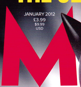
The next element I needed to place into the cover was the issue date and price. 

Typically, the date appears between the M, in a small, sans serif font. Since my background is quite dark, I'll be using the colour white for my date too. 


I chose Arial, as is it sans serif and very similar to the font Empire uses. I also chose white. 


I also noticed that the font gradually reaches a smaller size in a 'v' kind of shape to fit the shape between the M. 


With my own date, I started off with 'August 2011' in size 5, '£3.99' in size 4, and the rest in size 3. 


Compared to a real Empire cover, the placement, size and overall look of my date is pretty similar to the real thing. 

The next main thing I next input was the heading of the cover. Like most Empire covers, my header is the title of the film itself. 

I used the font TW Cen MT, as I earlier found that it's pretty similar to the Empire font. 
I selected the colour red as it's the main colour of the FD franchise, and it already fits the theme colours of my cover. 
Inspired by the Kick Ass cover, I decided to get a little creative with my placement of the text. 


With my own header, I set the text over the actor, to make the cover a little more dynamic. I think if I had set the header in its own space, it might not have felt quite as integrated. The sloping typography is much more interesting to read, and visually looks so much more appealing than just horizontal text. 
At the corners of the text, I added little splatters in red that is part of the text, similar to the Kick Ass header. This keeps the header tied in with the theme of the cover, and again, looks much more dynamic and interesting that standard typography. 

Also inspired by the Kick Ass typography, I joined some of my letters together. 


I did this by manually selecting the letters and placing them carefully how I wanted them. Some words couldn't be joined together, for example, the 'I' and the 'N' but some words could. By only joining some of the letters, I think this makes the typography look quite strange but it works very well. 


This is what part of my typography looks like after I've shuffled the letters around. 

However, there was something missing from my header that I wanted to pay more attention to. 
Empire's typography is a little strange, as I've found out before from research. 

The top letter is from Empire, and the bottom letter is TW Cen MT. Empire's font has 'slants' whereas most other fonts just have straight lines. 

To change this, I only had to make some simple tweaks to my typography. 


Using the line tool, I drew a slanted edge on the edges of the letters. 


Using the eraser tool, I simply rubbed out the edge left over, using the line as my guide. 


After all the tweaking, this is now what my front cover looks like. 


I added in a '5' in white, to stand out against the red and to create something interesting. I placed the 5 behind the rest of the heading again to play around with a more dynamic look to my cover. I also added some splattering around the 5, only this time a little more, because it's a much larger size than the rest of the header so needed more effects so as to keep it from looking plain. 


I did try to create a 'scythe' shaped '5' like FD's own artwork, but I felt that it looked wrong, compared to the rounded shapes presented on the cover. I also felt that the random pointed edge didn't fit in with the rest of the typography, so therefore didn't look 'integrated'.


So far, all the main elements have now been added to my cover. I now need to work around these elements to fill up the rest of the magazine. 

I collected a series of images of the different titles that Empire have had on their front covers, to give me a few more ideas of how to fill up space. 

Inspired again by the Kick Ass cover, I chose to further the theme of 'blood splatters'. I created a white blood splatter just under the 'Destination'. 


Inside, I inserted text, "NEW BLOOD!". The term means "new talent" which definitely applies to Steven Quale, as he's the newest director of the Final Destination series. The use of the word 'blood' also reinforces the gore theme. I think this phrase works well, and it's quite witty. Empire's covers are quite informal and exciting, which is the kind of tone I'm trying to get across in my production piece. 

I used the font TW Cen MT for the text, and manually moved some letters closer, to match the heading. I also chose to put the 'New' in the same red colour I've used throughout, to give it emphasis. Words like 'New' catches the attention of the audience, because they love to know all about the latest trends/films/etc.


This is the final placement of the 'NEW BLOOD' splatter, underneath the 'Destination' like the '5'. I felt that this matched well and I felt that it was very integrated within the layout which was very important to get right. So far the header section is very well balanced, and very eye pleasing, as the eye travels down and along the typography. 


So far, this is how my cover is looking. I'm really liking the striking colours of the red,white and black together. The next step is to input the rest of the typography/information, and I will need to determine whether I want to integrate another colour (perhaps a dark BLUE to match the colours of the Final Destination posters.)


Front Cover Photography/Editing/Graphic Design

The first photos I took for my front cover image, was of a model of a skull. I set the skull up in a dark boxed in shelving unit to achieve a completely dark surrounding, because this is the colour background I will have for the front cover. 
I used a Canon EOS 500d, which is a pretty good camera which takes some fairly professional, high quality photographs, and a Canon EF 50mm f/1.8 prime lense (fixed focal-point.) I used this lense as opposed to my other lenses because it's a good lense for portraiture, as it captures the details in faces extremely well. The skull model isn't a face as such, but it had a lot of detail that I would want to include in the final images.

The lighting was natural, from a large window nearby the set up, which makes the detail of the skull stand out fully. 
In my contact sheet, it is clear to see that I tried to see how the skull would look from all different kinds of angles, including head on, profile, and slightly stranger angles. I also tried to see how the skull would look with the jaws agape, and how that would effect my image overall.
I did this, because I wasn't entirely sure how the skull would work with the actor, and what would look best so I tried to cover the skull from all angles.

The next shoot I did, was of my actor. I chose a male actor, which quite a distinct jawline. I chose this kind of look, because I wanted the skull I'd taken photos of to fit closely with the face of my actor. 

Set up-wise, I used the same camera and lense as last time, and chose to use a black background. I attached a large piece of black paper to a wall, and seated my model in front of it. I used a soft box lamp to light my subject, and placed it low on the floor to the left, to create interesting shadows on my model's face.


From my contact sheet, you can see that I decided that I preferred how my model looked from the front, and I knew that this was how I wanted him to look. From further research from Empire front covers, I noticed that most of the characters/actors on the front cover are shot from the front, or at least are staring directly into the camera (therefore breaking the fourth wall, how Empire grabs the attention of the audience and tries to connect to them)

I did take a few shots of my actor with his jaw hanging open, if I was going to stick with the first cover idea of the 'dislocated jaw' type image. However, I didn't really like those shots very much, and preferred him to look straight-faced. 


Though I don't tend to use it, I tried out the flash on my camera, to see how this looked. I don't use flash normally, as I feel it rids the scene of the natural shadows and makes everything look very false/harsh/too bright. However, I realised that in most professional photo shoots, flash is often used.
I found that when I used flash, I actually thought it looked less professional, and looked as though I had been using some regular point-and-shoot camera. The background became more noticeable (the folds in the paper that I couldn't get rid of) and some of the shadows on the face that I liked so much had disappeared.


This was the photo that I liked the best out of the shoot with the actor. The shadowing to the right side of the face is perfect for adding the half-skull to the face, and overall I can see more potential in this image than in any of the others. 

Using Photoshop CS2, I first started editing my images by opening the portrait shot of my actor, and tweaking the colours. 


I first altered the brightness/contrast. To boost the shadows, I lowered the brightness, and I upped the contrast to heighten the highlights. 


I noticed that my image was far too orange, so to cancel this out, I fiddled around with the colour balance. I Turned up the cyan on full, which gave everything a green-ish, blue-ish tone which works much better with the 'horror' look of my image. 


I felt that my image was still far too colourful, so I altered the saturation, by lowering it. This took out a lot of colour and made the image more 'bland' and 'dull' looking which looked much more professional and better for what I needed. The FD posters feature actors with very pale skin, which allows them to contrast and stand out against dark backgrounds. 


To get rid of the horrible background, I used the 'magic wand' tool, which selects the background. I then deleted what I had selected.
Behind the image, I then added a plain black background.


So far, this is how my image is looking. Compared to what the original started off like, there is definitely an improvement. The edited image is much more professional looking, and embodies the horror genre much better. The plain background really forces the actor to stand out, and his paler skin works better for applying the skull to the right side, as it will blend in easier. 

The next step was to edit the photos of the skull I took. I chose an image of the skull from the front, the most detailed image I took. 


In Photoshop, the first thing I did was to flip the image around. I did this because the model was missing teeth on the right side, which I didn't want to include in my image. 


The next steps were to edit the skull in a similar way to the image of the actor. I lowered the brightness, upped the contrast and made the skull a cyan tone, though less than I did for the actor, as the skull image looked better when there was a more subtle colour to it. 


The last thing I did to the skull before editing it together with the actor's face, was to crop the image. I didn't crop it perfectly in half, because to blend the two images together, I'd need to graduate the images together, which means I'd need a little more of the image than I actually wanted. 


The next step was the insert the image of the skull into the document of the actor's face. Before I did this, I played around with the size of the skull, to get the skull to match up to the face perfectly. 


I also got rid of the inside of the skull's eye, by using the brush tool and a fairly large brush size. 


I basically drew round the shape to create a 'hollow' look which would make the skull look much less cartoon-like. To blend the black colour in with the rest of the skull, I used the blur tool around the line where the black meets the rest of the skull, to blend the colour in. I also used the smudge tool to drag the outside of the skull into the black, to again blend it in better. 


I also used the eraser tool to fit the skull to the head better, and to match the jawline. For the moment, it looks very rough, but later I will blend the edges much better. 


For the first stage of blending in the skull, I used the brush tool in black to go over the face - working into the shadows better. I did this because the skull over the top will need a dark colour underneath to show the cracks better. 


The next step was by far the most difficult: creating the cracked effect on the skull and blending the skull in with the face. I started first on the forehead and eye, since this would be the most difficult area. 

I first downloaded photoshop effect brushes from deviantART. 


Special effects Photoshop brushes work similar to how the normal round brushes work, but are in different shapes. Photoshop is very customisable as it allows you to download custom/special brushes to use. You can change the size and colour of the brush, which also adds to the custom-ability.


This is an example of some of the crack brushes I used. The crack brushes I placed on the skull were in black, to show up properly against the pale skull. 


I've found that the best way to get good effects using Photoshop brushes is to use lots of different ones, in different sizes and opacities. I also like to overlap the brushes to create different looks, and to make some areas a bit more heavily built up. 

To blend the skull in with the face, however, I had to get a little more creative. Still using the Crack effect photoshop brushes, I used the brushes for the eraser tool. 


Like the brush tool, the eraser tool can use all the same shapes. I used this to my advantage. 


Here, you can see where I've applied the eraser tool using the same method as the one I employed with the black brush tool. By using the eraser tool in this way, I've ensured that my skull fades into the face well. 

Both these methods of using the brush tool and the eraser tool are quite lengthy and requires me to flip between both tools quite often, and I usually undo a lot, to make sure I've got the right effect I want. 


This is the result of the editing techniques I've explained about. I'm very happy with how this has turned out. I think this idea was much better than the 'dislocated jaw' idea I had, as I think I would not have been able to create the right effect very well. I think this image is successful, because the skull/face idea is very simple but because I've managed to edit it well, is very powerful. I think this kind of image would stand out very well on the front cover of Empire.